Brand Guide
Brand Elements
Colors
We use to color to energize our marketing materials and create assets that capture attention. Consistent use of color is also crucial for building strong brand recognition and equity.
Overview
Our brand palette is robust, versatile and vibrant
Our palette is composed of eight core colors, plus a wide set of tints and shades. It has a vibrancy and dynamism that helps to lift our story and give our communications an optimistic tone. It also offers excellent color pairing options, no matter your medium—print to digital, and static to motion. Please adhere to the usage rules and color values outlined in this section when using our brand palette.

Understanding the palette
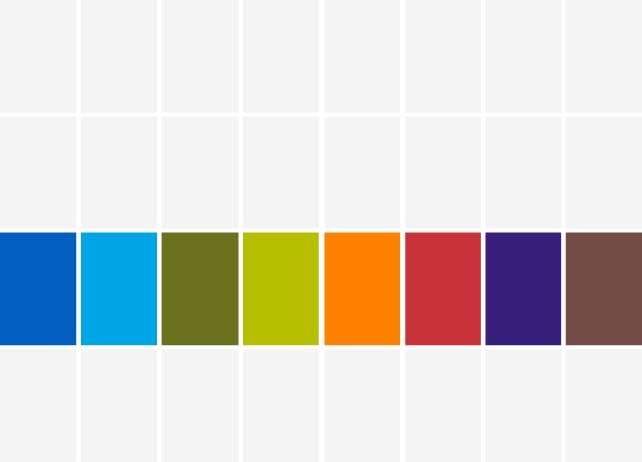
Core colors
Our eight core colors are the cornerstone of our brand palette.
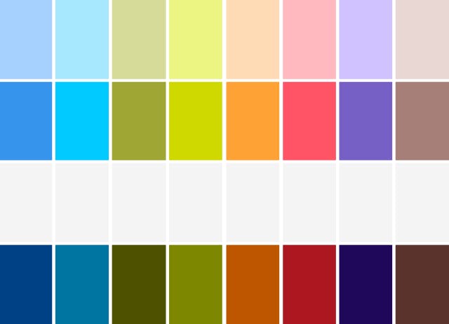
Tints and shades
Use tints and shades of our core palette to add variety and enhance contrast in designs. Do not deviate from the specified tints and shades outlined in this guide.
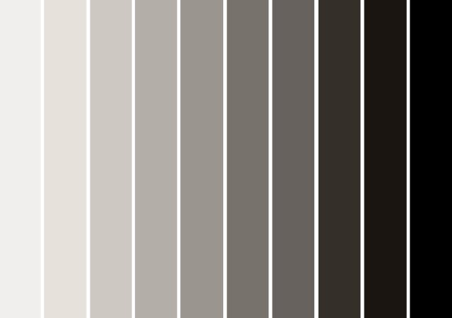
Greyscale tones
Our palette of greyscale tones has been updated from previous iterations to have a warmer cast.
Color values
Adhere to the values below when using our core colors, including their tints and shades. Please note that colors appear different on screen versus printed. Our CMYK colors have been print tested, so please use CMYK for print to ensure that your colors will be on-brand.
Greyscale tone values
Product and vertical marketing
Strategically using color in marketing collateral
In order to create a strong sense of consistency and reinforce the importance of our technology ecosystem, product marketing materials and vertical marketing materials each use dedicated color palettes.
The below sections outline the strategic and approved colors that should be used across product marketing campaigns as well as for the specific verticals our products and technologies support. Our templates also support these new color palettes.
Product marketing
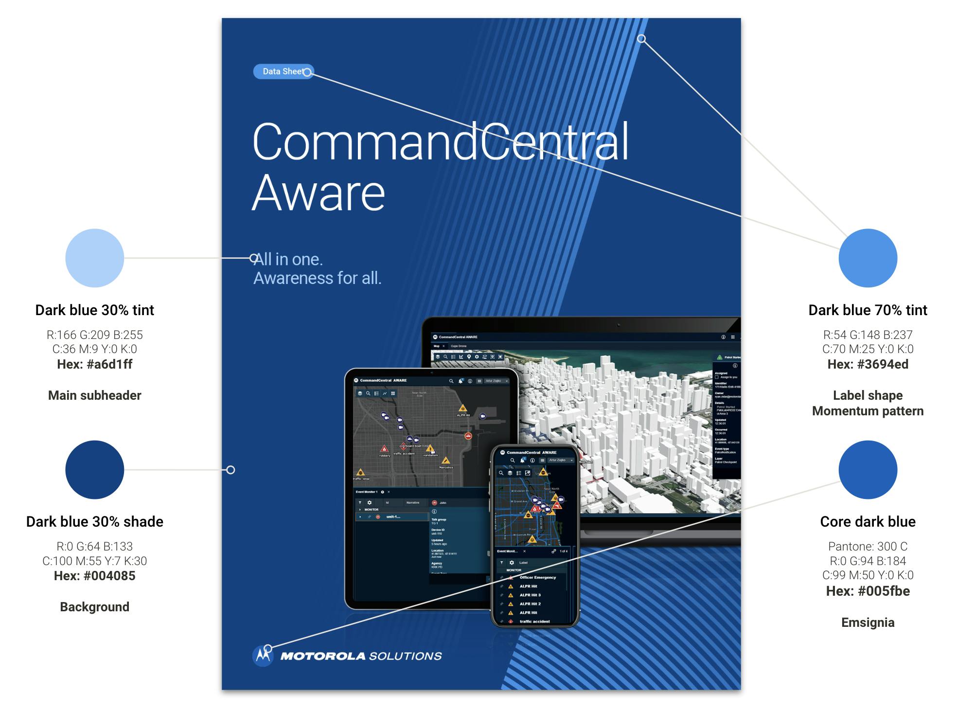
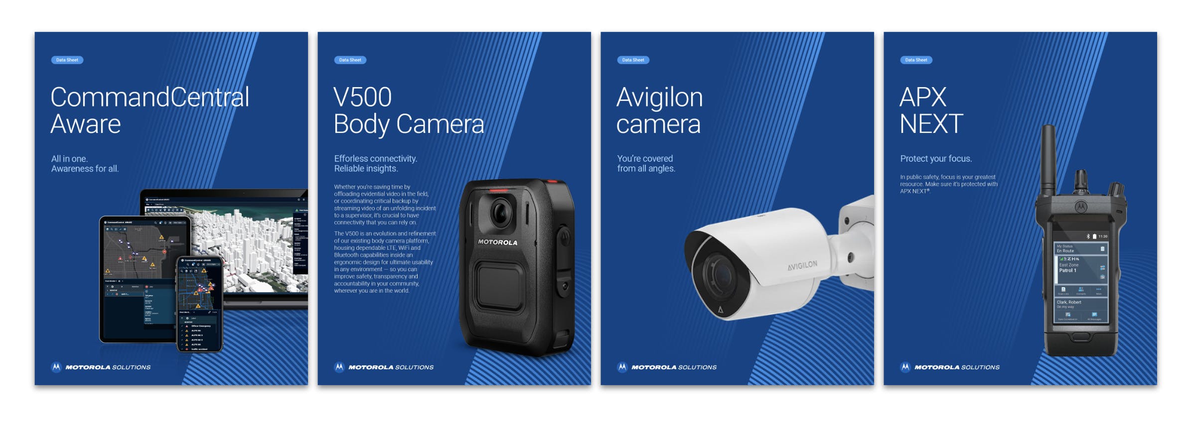
Product marketing materials focus on the features, benefits and specifications of a certain product or family of related products. These materials can be defined by their agnostic nature – they are true regardless of audience or industry, although they may be customized for different regions. All product marketing materials use a special dark blue color palette from our brand colors.
Visit the collateral templates page to download the latest templates for long-form and multi-page product marketing documents as well as data sheets. These already have the approved colors built in.
Refer to the diagram to the right to learn more about the correct brand colors which will be used throughout product marketing materials.
If the asset you require speaks directly to or customizes features for a certain vertical, refer to the vertical marketing section to find a different color strategy to follow.
Take the opportunity to switch outdated product marketing assets (with custom color palettes) into the new dark blue color palette as edits or other design refresh requirements are naturally needed. There is no need to immediately submit all custom-color assets for redesign.
Do not introduce any additional highlight colors in product marketing materials.
Do not use or request (from internal teams or agencies) custom color palettes for any product marketing materials of new or refreshed product assets.
Vertical marketing
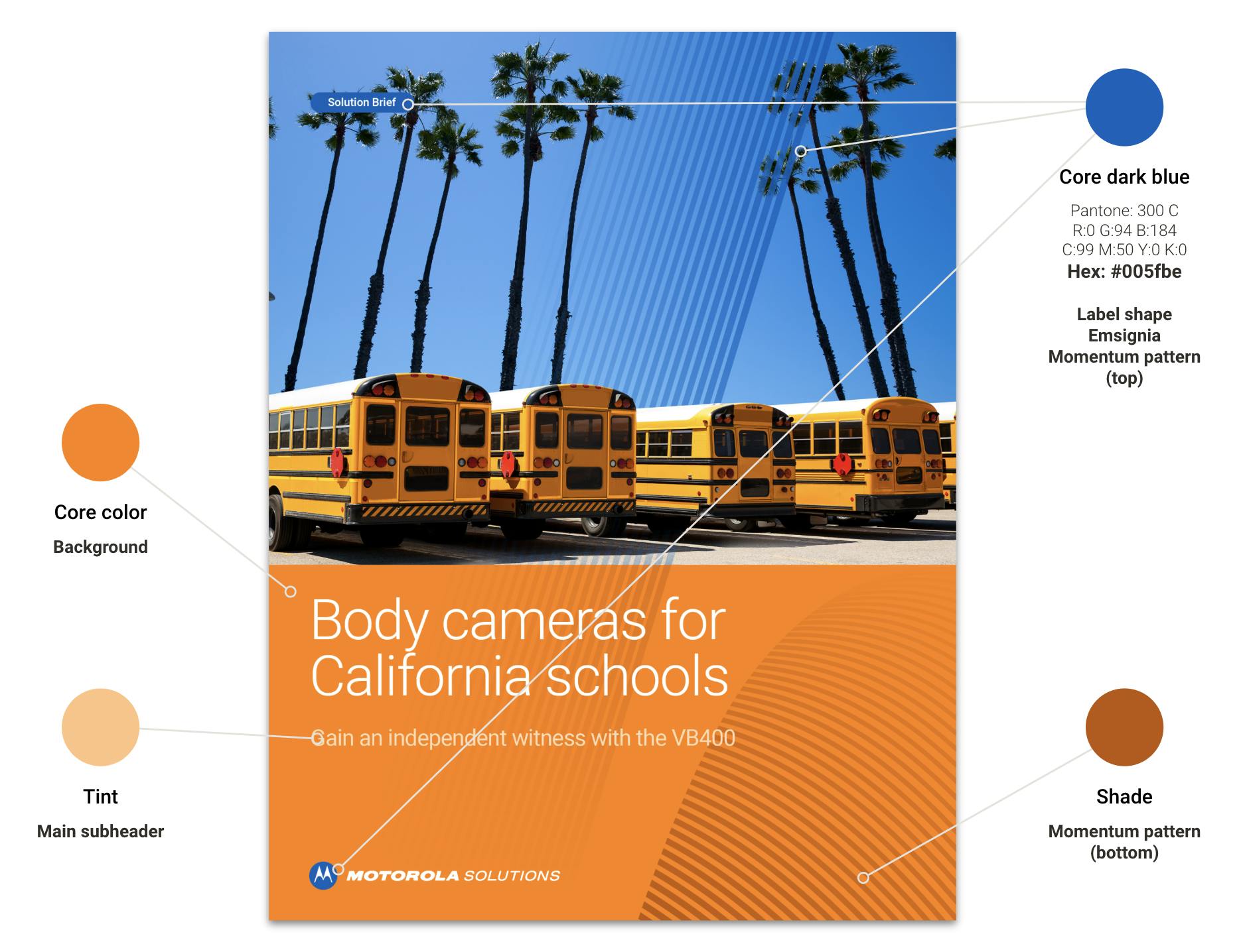
Vertical marketing adapts and customizes the content, imagery, features and narrative of promotional materials to speak directly to a certain vertical. Each of our verticals has been assigned a strategic color palette from our brand colors, which will be paired with our core dark blue in material designs.
Visit the collateral templates page to download the latest templates for long-form, single-page and multi-page vertical marketing documents. These already have the approved colors built in.
Refer to the diagram to the right to learn more about the correct brand colors which will be used throughout product marketing materials. A list of specific colors and their associated verticals are listed below.
If the asset you require speaks in a vertical-agnostic way about a product, technology or service, refer to the product marketing section to find a different color strategy to follow.
Take the opportunity to switch outdated vertical marketing assets into the new strategic color palettes as edits or other design refresh requirements are naturally needed. There is no need to immediately submit all outdated assets for redesign.
Do not introduce any additional highlight colors in vertical marketing materials.
Do not use or request (from internal teams or agencies) alternate color palettes for any vertical marketing materials of new or refreshed vertical assets.

Colors for enterprise verticals
Colors for government verticals
Downloads
Color downloads
All brand color formulas are available in a Google Slide in order to copy and paste into your design software and Slides presentations.
GOOGLE Slides
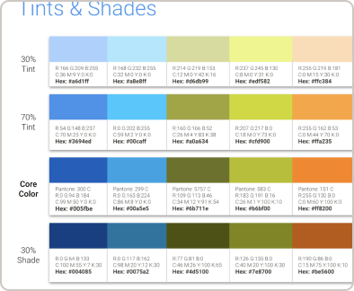
Brand colors
Brand color formulas in a format that you can copy and paste into your design software.