Brand Guide
Brand Elements
Patterns
Our brand uses simple visual patterns to add interest, depth and emphasis to designs. Our brand patterns are derived from and anchored by our Emsignia for a purposeful and strong brand connection across all assets.
Overview
We have two brand patterns: Momentum and Clarity
The Momentum and Clarity brand patterns have a purposeful simplicity and boldness. They should be used to add a signature style and sophistication to designs. Please adhere to our guidance and usage rules to maximize their impact and maintain their consistency.

Momentum pattern
The Momentum pattern speaks to concepts of streamlining, connectivity and new pathways. It can evoke a sense of acceleration, amplification or a force rippling outwards.

Clarity pattern
The Clarity pattern speaks to concepts of perspectives, focal points and moments of illumination. It can evoke a sense of focused attention, heightened awareness and clear insight.
Momentum pattern
Learn how to correctly use the Momentum pattern

The primary Momentum pattern is derived from our Emsignia
It always includes the curved middle element between a forward slash and a back slash.
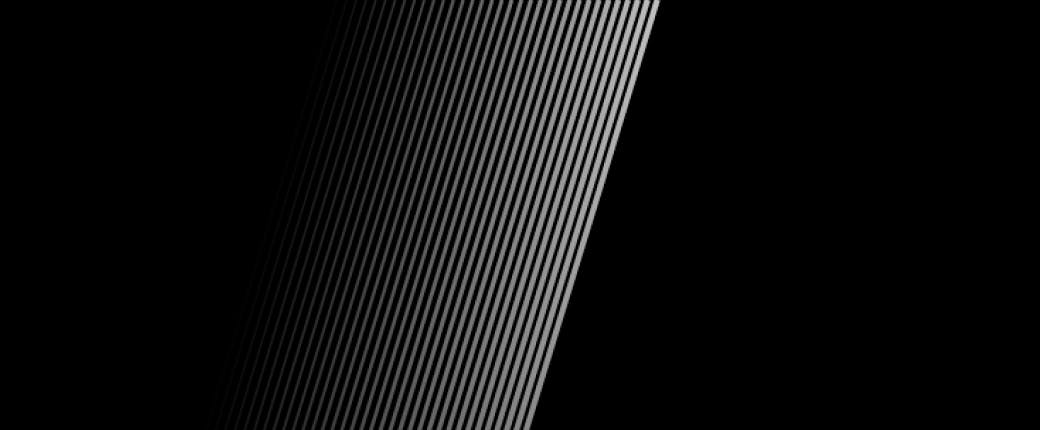
The secondary Momentum pattern can be used as a forward slash or as a paired set of forward and back slashes
The secondary Momentum pattern is provided in a variety of orientations and arrangements. See downloads at the bottom of this page.
The primary Momentum pattern must be used before the secondary pattern in any design. In other words, the secondary pattern can not be used unless it has been preceded by the primary pattern. This helps to establish the Momentum pattern’s connection to our brand.
The secondary Momentum pattern must be preceded by the primary Momentum pattern.
The Momentum pattern lines can be white, a tint or shade of the background color or an approved color pairing with the background color. Please see the Color page for detailed rules on color pairing.
Momentum pattern usage
Here are some general rules to keep in mind when using the Momentum pattern.

The primary pattern must be used in collateral before using the secondary pattern.
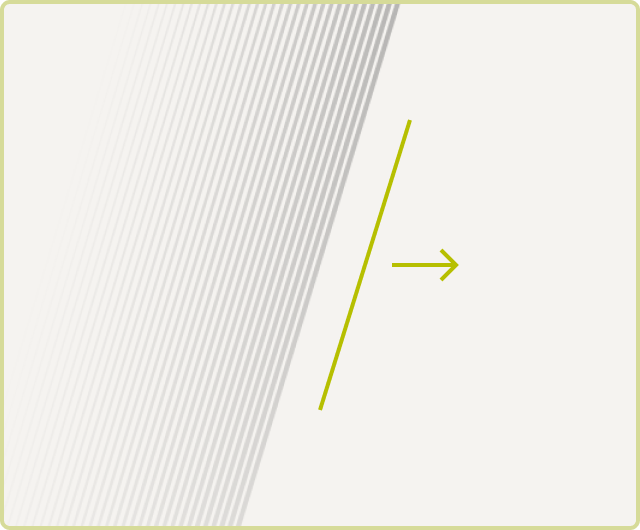
The pattern should always include a forward slash orientation.

The pattern can use a tint or shade of the background color.

The pattern can use an approved color pairing.

The pattern can use a tint or shade pairing to “split” the composition.

The pattern can use a two color pairing to divide the composition.
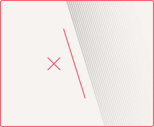
Do not use back-slash orientations alone. (They can be used as part of the primary Momentum pattern.)
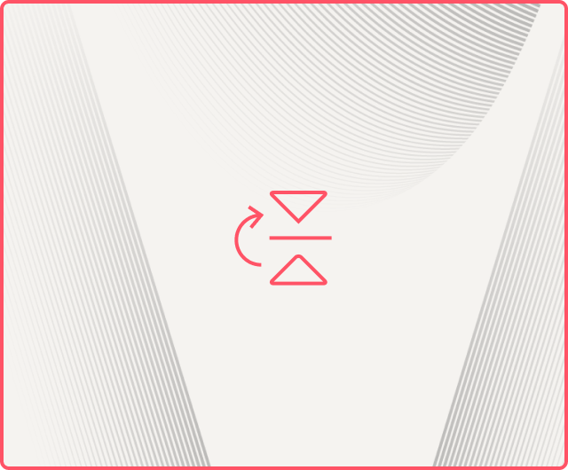
Do not flip patterns.
Do not rotate patterns.
Momentum pattern scale
The scale of the Momentum pattern may vary slightly depending on the application, but it should never be so small or so large that it loses integrity. There are five approved scales available for download, please use the scale that best adheres to the guidelines below.

The pattern is too small when individual lines blur together or get lost.

The scale is just right when you can see the full shape of the pattern and the lines are thin but clearly discernible.

The pattern is too large when the full shape of the pattern is lost, or the lines begin to feel like thick bars.
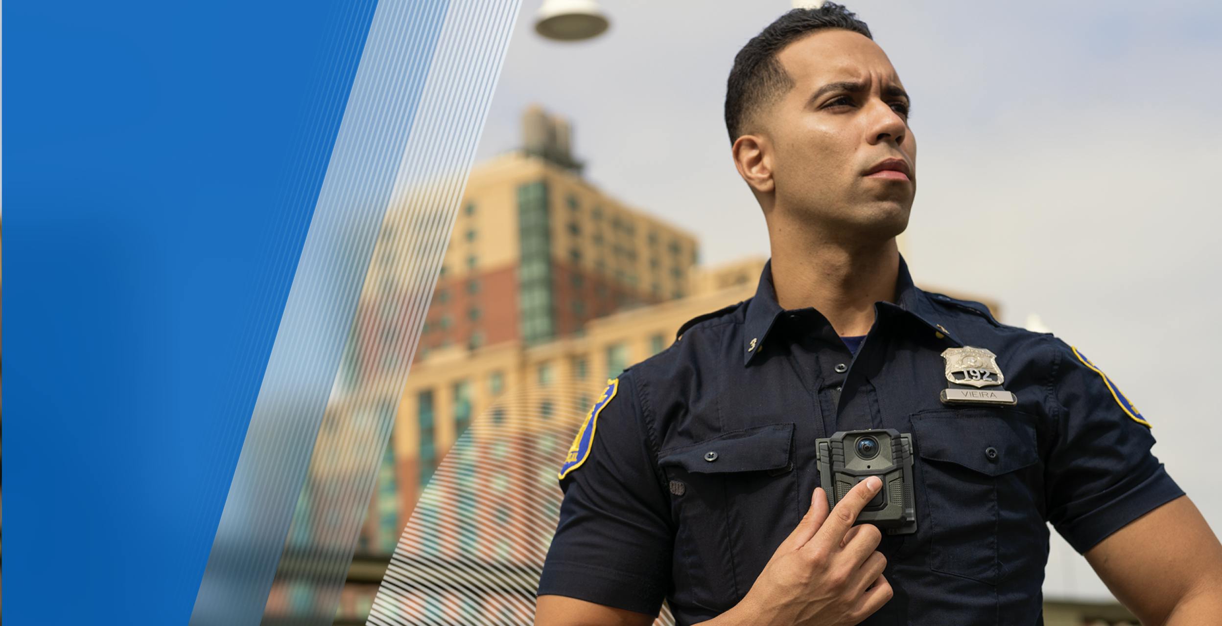
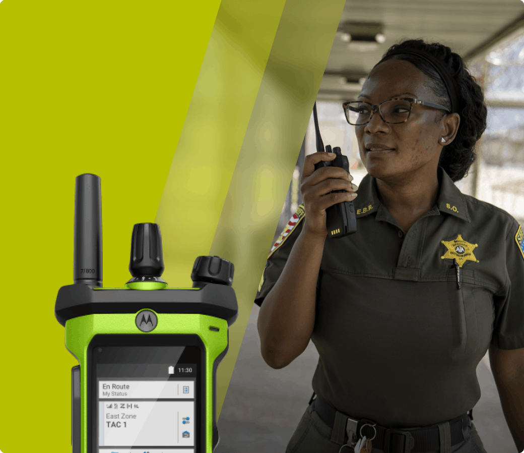
Momentum pattern and photography
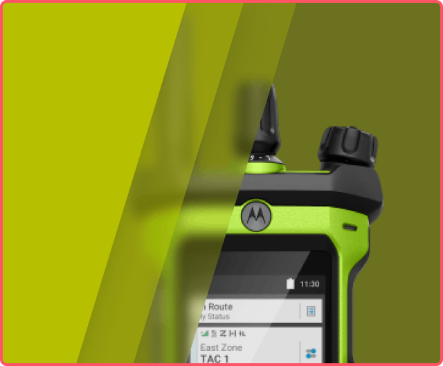
Using the pattern to add dimension or emphasis in photography can make images feel more interesting and ownable.
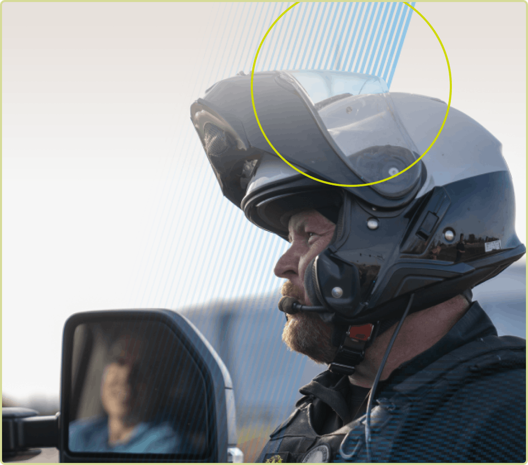
You may mask the subject of a photo so the pattern appears to be behind them, This adds a sense of space to the design.
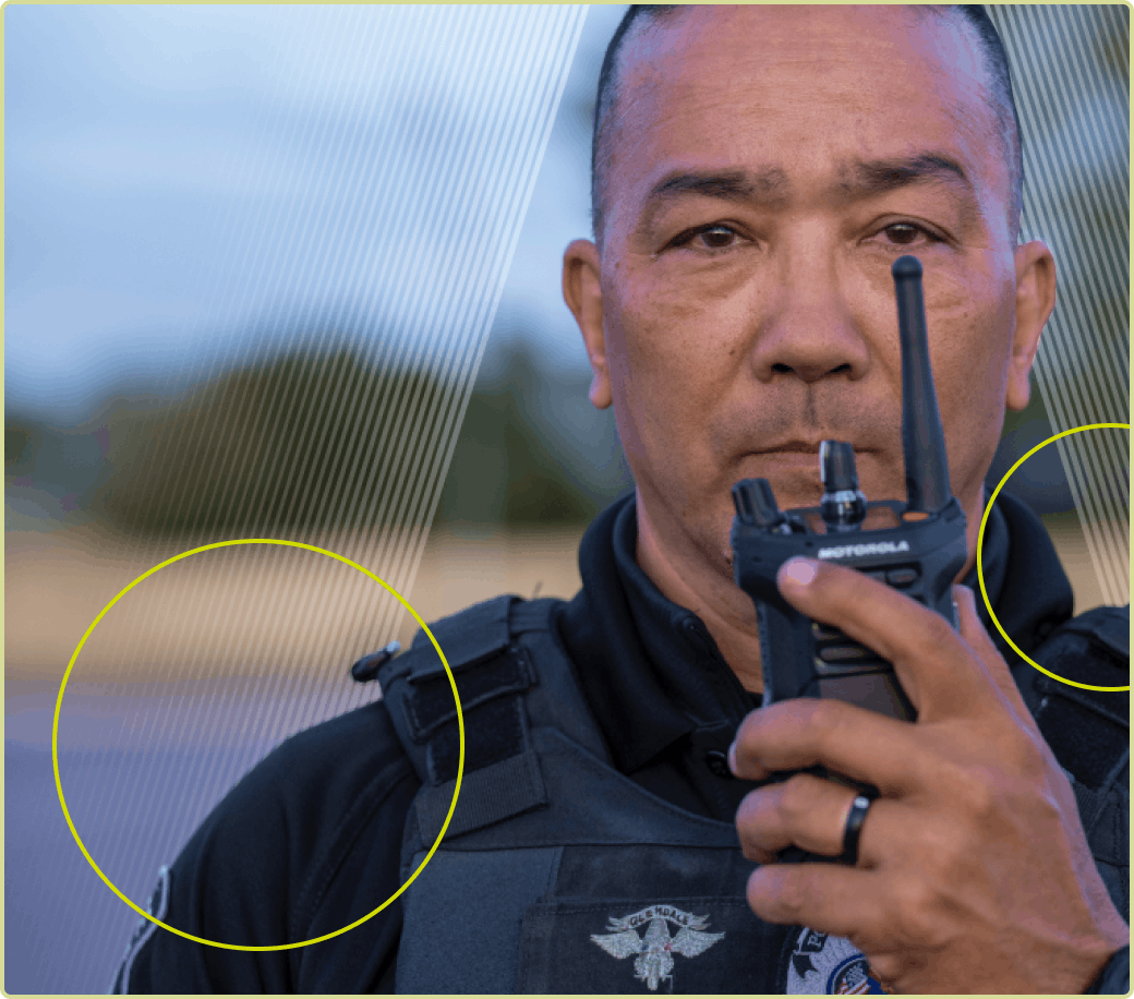
Be sure the overall shape of the pattern is not lost. As a general rule, at least 2/3 of the pattern should be visible around the subject.

Do not cover the primary subject of a photo with a pattern.

Never overlay patterns on top of products.

Do not add extraneous effects like drop shadows to patterns.
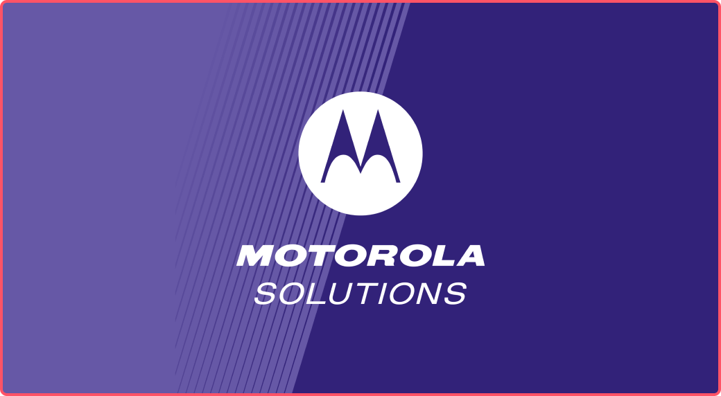
Momentum pattern and Motorola Solutions Signature
The Momentum pattern is designed to exactly match the angle of the M in our Emsignia and this should be leveraged in asset designs.
Whenever possible, use the horizontal Motorola Solutions signature and align the second "forward angle" of the Emsignia graphic with the primary line of the Momentum pattern.
When the full Motorola Solutions signature is also present in the design, you may also align the Emsignia with the primary Momentum pattern line on its own.
The vertical Motorola Solutions signature may be aligned with the second "forward angle" of the Emsignia graphic when the Momentum pattern is used over one solid color background.
Do not use the vertical Motorola Solutions signature when the background is being split between two solid colors in addition to the Momentum pattern, as this creates too much interference with the wordmark text.

Do not place the Motorola Solutions signature with random placement when it could be aligned with the primary Momentum pattern line.
When aligning the Motorola Solutions Signature with the primary Momentum pattern line results in incorrect safe space for the signature, prioritize shifting the Momentum pattern in order to achieve correct safe space.
Clarity pattern
Learn how to correctly use the Clarity pattern

The Clarity pattern consists of three to five bands in the same forward-slash angle as the Momentum pattern, with increasing amounts of transparency and background blur—much like multiple layers of frosted glass.
The Clarity pattern should only be used on top of imagery.
It’s best used to divide compositions and create an appropriate space for text or product imagery to be paired with lifestyle/workstyle photography.
The Clarity pattern can be used in any single color in the Motorola Solutions color palette.
Example of a Clarity pattern with three bands.
Example of a Clarity pattern with five bands.
Clarity pattern usage
Here are some general rules to keep in mind when using the Clarity pattern.

Do not use the pattern to split two images. The pattern should always transition to a solid color.
Do not cover product photography with the pattern.
The pattern should not be used with solid colors only. It should integrate a background image for the “frosted glass” effect.

Do not use more than one color in the bands of the pattern.

Do not vary the width of the bands—they should always be uniform.

Do not arrange the bands in any way other than a single forward-slash.

As an option, the Momentum and Clarity patterns may be combined to add another layer of texture and interest to design applications.
Only combine the patterns if it enhances the design in some way. If it adds visual noise or compexity, opt for a simpler design with only one pattern style.
All other usage rules regarding the Momentum and Clarity patterns outlined in previous sections still apply when combining the patterns.
Downloads
Brand pattern downloads
Our pattern files have been designed to offer the best possible flexibility and ease of use for digital projects, collateral and displays. Using them in their provided file format will result in the best quality appearance. Please use all pattern files in accordance with the rules outlined in this section.
DRIVE FOLDER

Momentum Patterns
Download the Momentum pattern in AI format and a range of color options.
DRIVE FOLDER

Clarity Patterns
Download the Motorola Solutions Clarity pattern in a variety of colors and scales.