Brand Guide
Brand Elements
Iconography
Icons are an essential visual device for our brand. They help emphasize key messages, improve the UX of products and digital experiences and add a signature visual element to our storytelling.
Overview
Clean, functional icons complement our brand
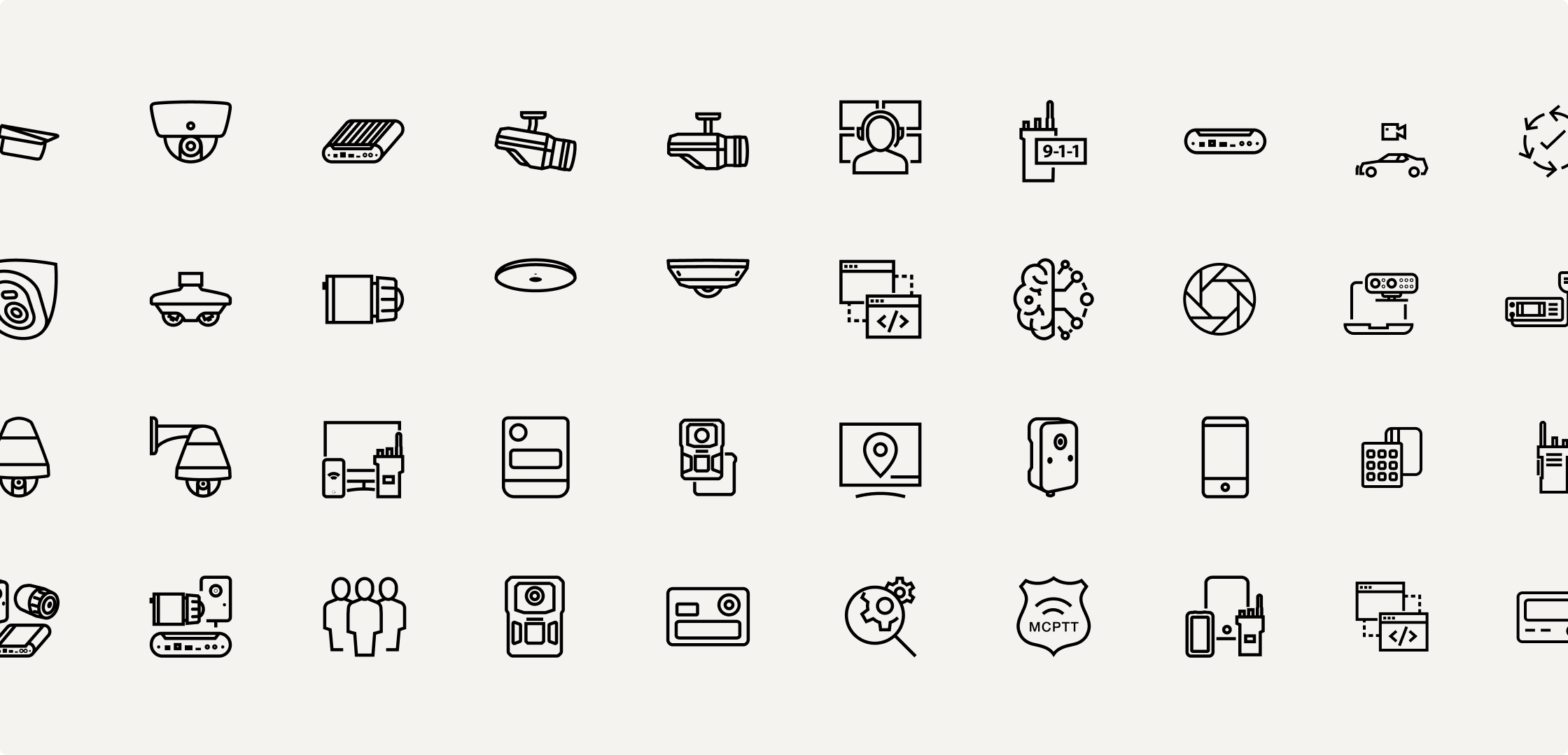
Our icons are designed to help clearly articulate complex information with simplicity and meaning. Clean outlines, minimal detail and a limited color palette make them easy to understand, even at a thumbnail size. Please only use icons from our approved library. If you do not find a specific icon, please make a request to have one created.

Concepts and key messages
Icons can be a great visual aid to key messages, helping to drive home the concepts that are most important to our business.
Products and devices
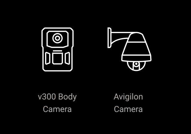
Icons can be representative of our products and devices, helping customers quickly recognize and remember their key features.

Features and services
Icons can also represent features of products or services we provide. These may be more abstract and are best aided by copy.
Icon design
Our icons need to communicate a limitless amount of concepts and subject matter while maintaining a uniform style. To achieve this uniformity, each icon must have a consistent stroke weight and similar visual density.
Icons should be clear and identifiable, without unnecessary or extraneous detail.
Icons should feel sophisticated and universal.
Icons should not feel cartoonish or overly stylized.
Creating new icons for the library
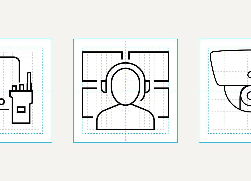
If you cannot find a suitable icon in our library, you may create a new one. Please adhere to the guidance below to ensure that the new icons have a consistent style and communicate effectively.
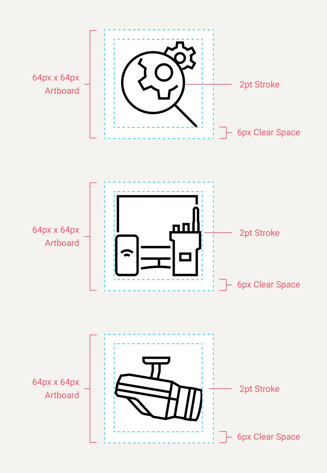
All icons should have a uniform size (64px x 64px). As icons decrease in size, detail should be minimized to keep them recognizable.
Icons should be centered with in a 64px x 64px artboard, with 6px padding on all sides so that the icon content does not exceed 52px x 52px.
Icons should be aligned to the “visual” center of the artboard. If an icon is weighted on one side, move it to the “visual” center. (The exceptions to this rule include Persona, Vehicle, and Device icons.)
All strokes in an icon should be of uniform weight. At 64px, the stroke weight should be 2pt.
Icons should always have a transparent background and use a default stroke color of black (HEX #000000).
Icon file names should always be lowercase and separated by dashes with no spaces. Filenames should end with the icon size in pixels and first letter of the icon color (eg, “police-general-64-b” indicates the black version of this icon).
Icons should not contain any filled shapes. Some small device elements like buttons and slots can appear "filled" by assigning the Align Stroke to Inside setting to our standard 2pt stroke weight.
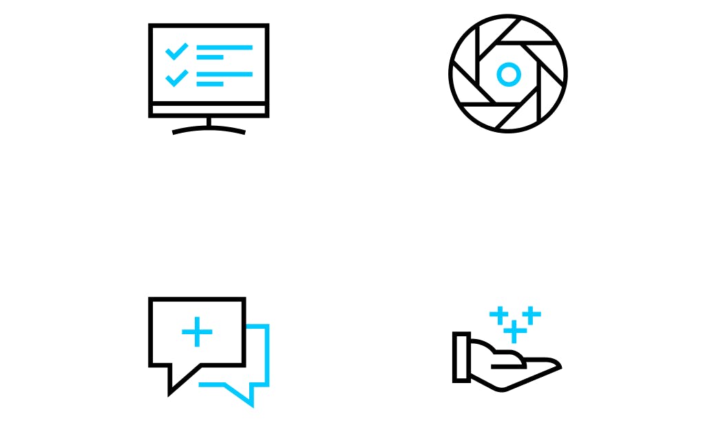
Two-color icons
Motorola Solutions icons should primarily be used in a single color—black, white or a brand color that provides suitable contrast.
Two-tone icons are available for brand pages on the Motorola Solutions website only. We are developing new guidelines for how existing icons can be converted to two-tone format. In the meantime, please contact the Global Brand team with inquiries about using two-tone icons on your webpages.
Icon usage

Do not use multiple colors in iconography. Icons should only be one brand color, or one brand color and black.

Do not vary the line widths in an icon except in special circumstances as directed by the Brand Creative team.
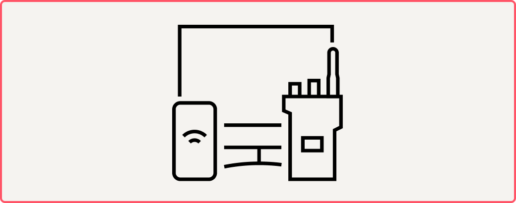
In digital, web, and smaller print collateral, do not scale icons larger than 200px x 200px, or 1in x 1in.

Do not lock up icons with text so that it looks like a logo. Never lock up an icon with the Motorola Solutions logotype.
Downloads
Icon library access
Motorola Solutions offers a library of over 500 brand-approved icons in EPS and PNG format. Browse our MSI Icon Library catalogue to choose the icon that will work best in your design, then search and download the icon format you need from Brand Portal.
Google Slides
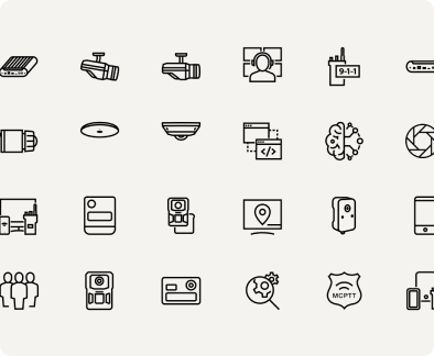
MSI Icon Library
Browse our catalog of 500+ icons.