Brand Guide
Brand elements
Layouts and grids
Our system allows us to vary the design and content layout from one communication platform to another, maximizing the impact of each piece while maintaining consistency.
Overview
Our grid system
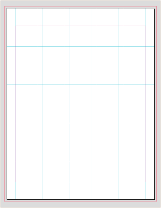
All documents should follow a 5x5 grid system, designed to showcase our imagery and provide ample room for copy. To provide a consistent user experience, all documents should be designed in portrait format, with any exceptions approved by the Brand Creative team.
Grid template

Examples of how the grid can be used

Long-form document cover
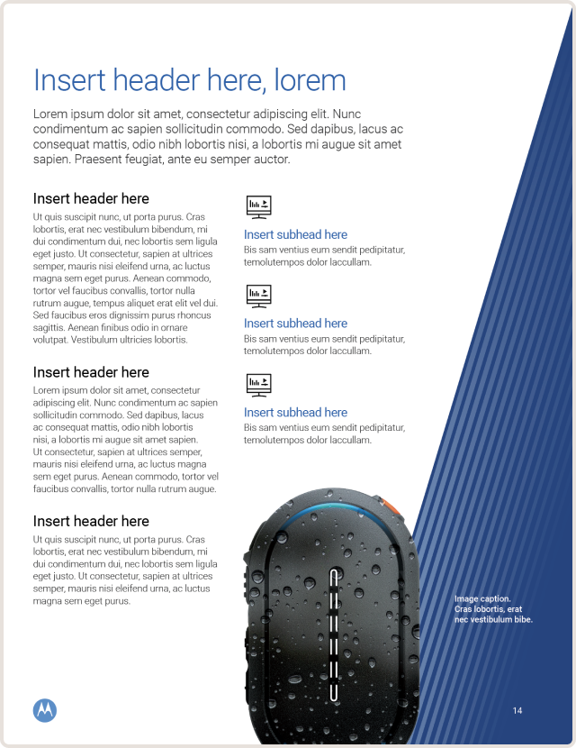
Data sheet
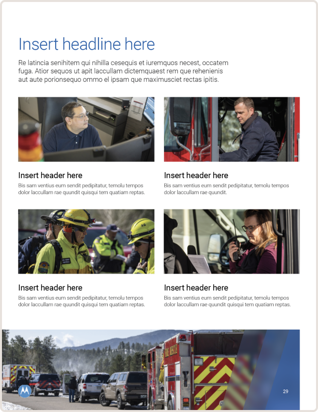
Fact sheet
Placement of elements
Our layouts use a 5x5 grid system that divides your design into five rows and five columns. The points where the vertical and horizontal lines meet to form natural guidelines for where you should place your subject and supporting elements. Although vertically, the page must always be divided into 5 rows, pages may be divided into 2, 3, 4 or 5 columns based on the content you need to present.
Margins
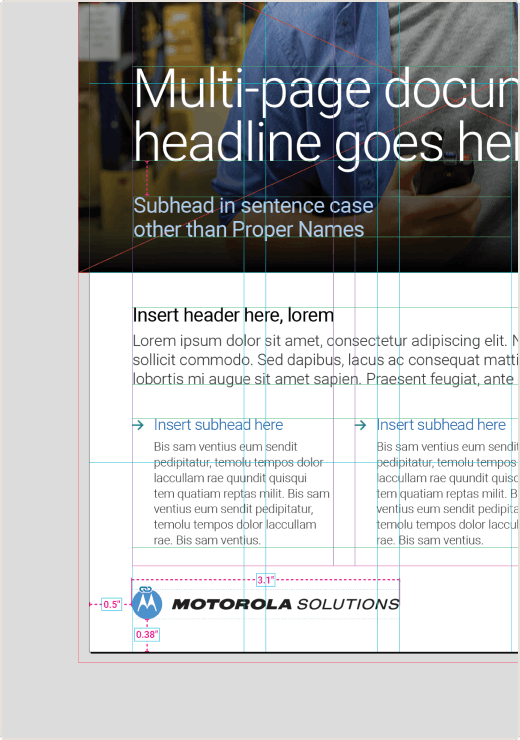
All layouts should utilize a 1 inch (25.4mm) margin from the top and bottom edges of the layout and a 0.5 inches (12.7mm) margin from the left and right edges.
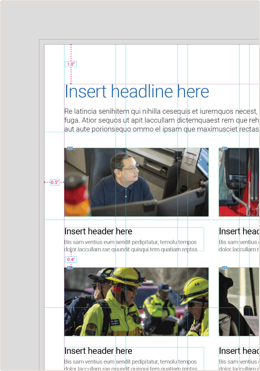
Logo placement
For covers and back pages, the full horizontal Motorola Solutions Signature should be placed on the lower left corner of the page along the 0.5 inch (12.7mm) margin. The width of the signature is 3.1 inches (78.74mm) and must be allotted full clear spacing. Signatures on cover pages should be 0.38 inches (8.304mm) from the bottom of the page.
Emsignia placement
For interior layouts, the Emsignia should be placed on the lower left corner of the page. The size of the emsignia is 0.3468 inches (8.791mm) corresponding with the 3.1 inch width of the signature on the front cover. It must always have full clear space and be placed 0.38 inches (8.304mm) from the bottom edge of the page.

Downloads
Grid templates
Visit the Collateral page for a breakdown of the InDesign templates available, all of which include and are based on our 5x5 grid.