Brand Guide
Brand Elements
Typography
Our brand is defined by a strong typographic expression. Our typography principles are based on function and format, and their purpose is to maintain a distinctive style across all communications.
Overview
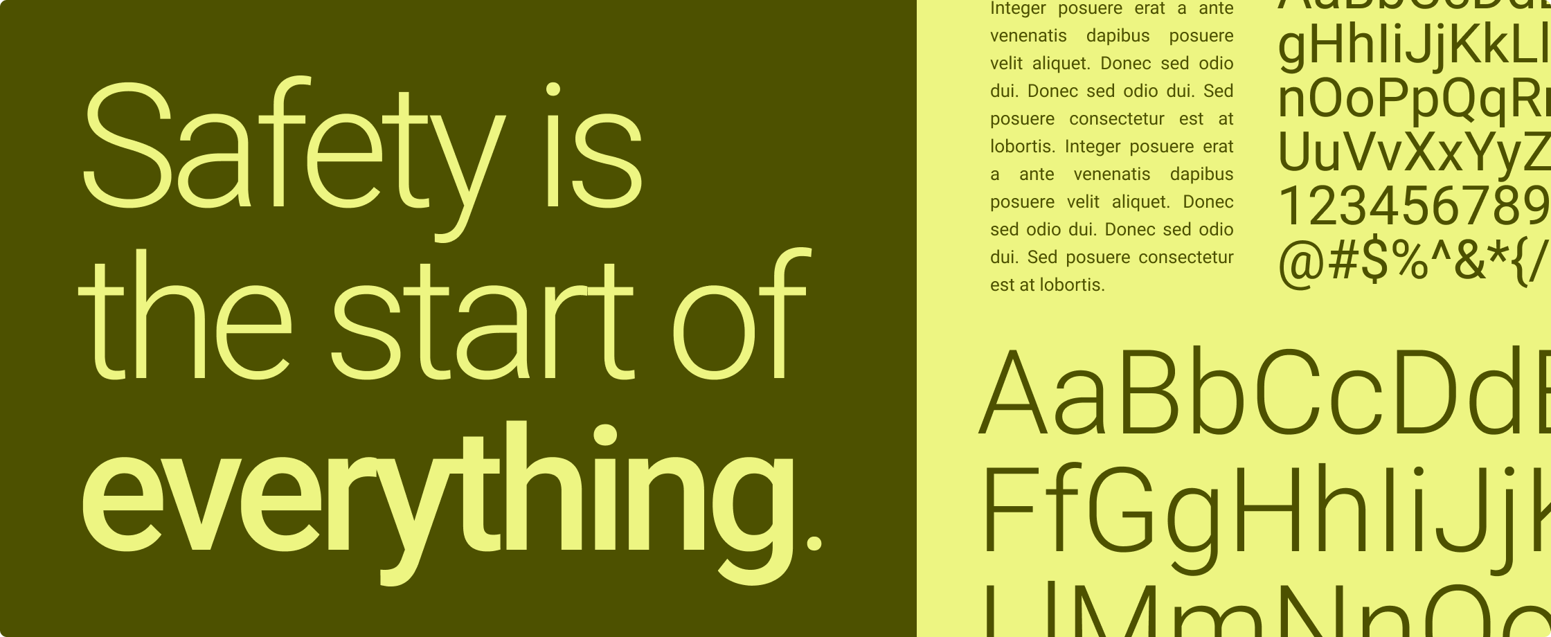
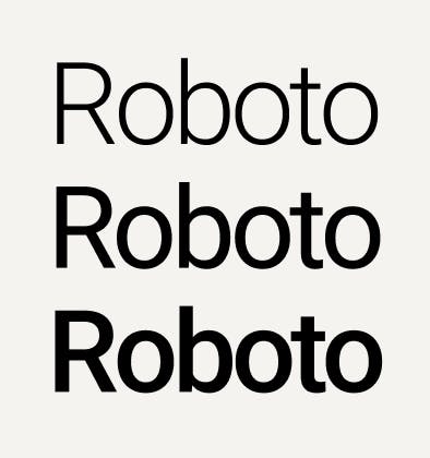
Roboto is our official brand typeface
Roboto is available as a Google Font and can be easily used in both digital and print designs. Please review the permitted weights, treatments and usage rules before applying the font in designs. Only Roboto Light, Roboto Regular/Normal and Roboto Medium weights are permitted for use.
Weights
The Roboto font is permitted to use in three weights. Any other weights are for design team use only.
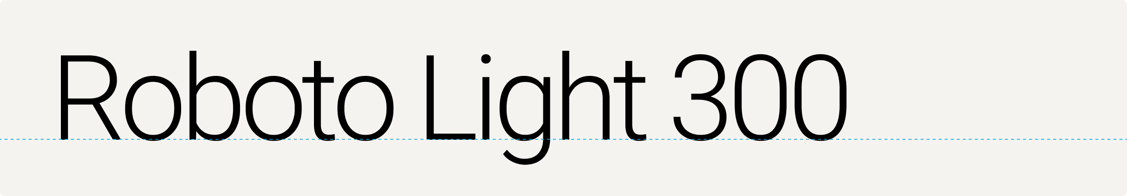
Roboto Light 300
For headlines and body copy.
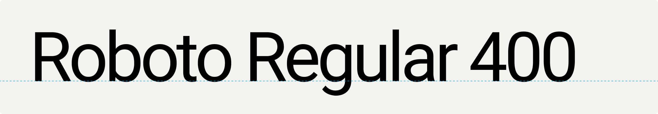
Roboto Regular (or Normal) 400
For sub-headlines. This weight is called Normal in Google Slides and Google Docs.
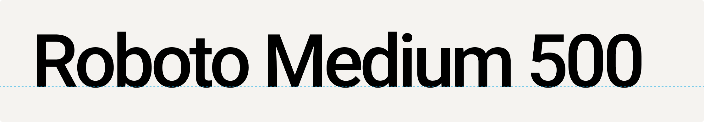
Roboto Medium 500
For small labels and emphasized text. Use with discretion. When using Google Slides and Google Docs, always select Roboto Medium from the Font dropdown instead of clicking the "Bold" button.
Capitalization
Our design approach and ecosystem-focused messaging aims to be more approachable, conversational and welcoming. For this reason, we use sentence case capitalization for headlines and subheaders and reserve title case capitalization for proper names, including the names of products, features and Motorola Solutions programs.
Headings and subheadings use sentence case, where only the first letter of the first word is capitalized.
Use title case capitalization as officially assigned to specific products, product lines, technologies, features and programs.
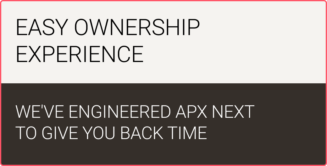
Do not use all-caps capitalization for headlines or subheaders. All-caps may be used in labels, captions and buttons only.
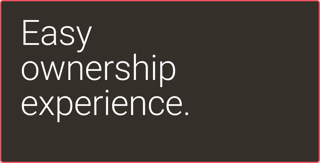
Do not add periods to the end of headlines or subheaders, even though they use sentence case capitalization. In some limited instances, where your headline or subheader contains two full sentences or statements, you may add periods to divide each statement. Please use with discretion.
Hierarchy and scale
A clear hierarchy of typographic elements is key for effective messaging. To create a strong visual hierarchy, please adhere to these principles when laying out typography in a composition.
Headlines should be the hero. Large headlines have a dramatic effect and draw in our audience to read more.
There should only be one primary headline per communication.
Subheads should be no more than 1/4 the size of the headline in most applications. This may not be possible in smaller collateral like banner ads or social posts.
Body copy should always be typeset the same way — 10pt font size with 13pt leading, using Roboto Light.
Headlines, subheads and intro text may be used in a more flexible range of font sizes to achieve the hierarchy and page layout that works best for your design.
Whitespace is welcome. Make sure typography has comfortable margins and ample clear space to create communications that feel clean and approachable.
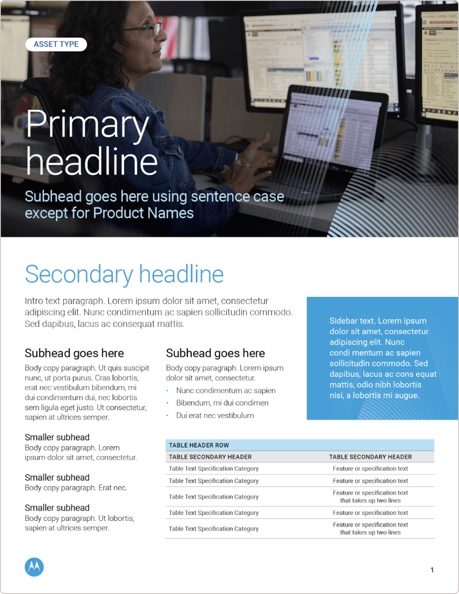
Sample brochure with clear typographic hierarchy.
Typesetting
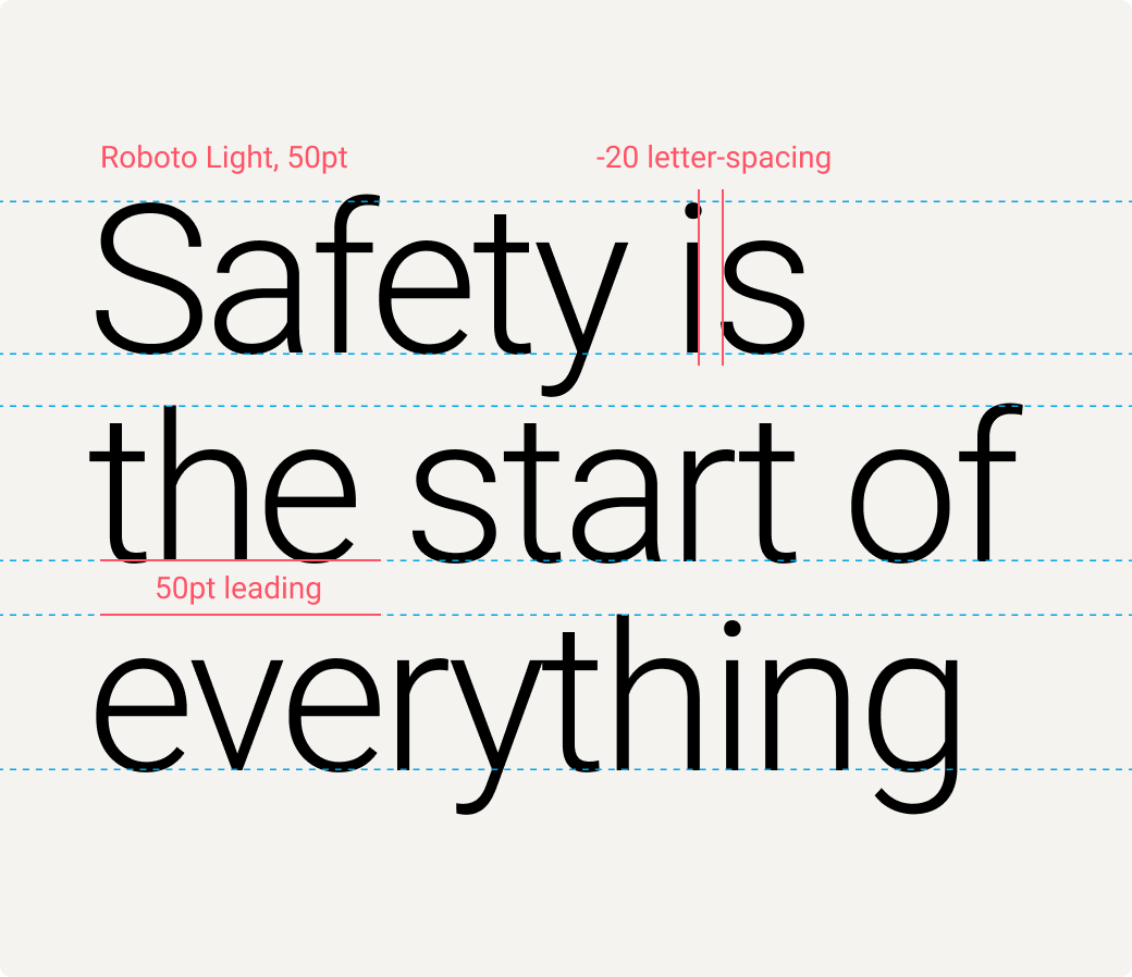
Headlines over 40pt size
Headlines at this size should be typeset in Roboto Light with -20 letter spacing (tracking) and a line spacing (leading) value that matches the font size value. For example, a 50pt headline should use a 50pt leading value.
Headlines should be in sentence case with no punctuation.
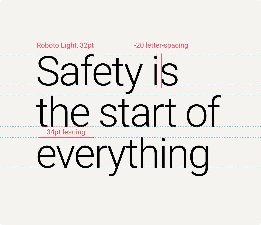
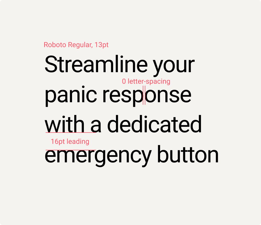
Headlines under 40pt size
Headlines at this size should be typeset in Roboto Light with -20 letter spacing (tracking) and a line spacing (leading) value that is 2pt larger than the font size value. For example, a 32pt headline should use a 34pt leading value.
Headlines should be in sentence case with no punctuation.
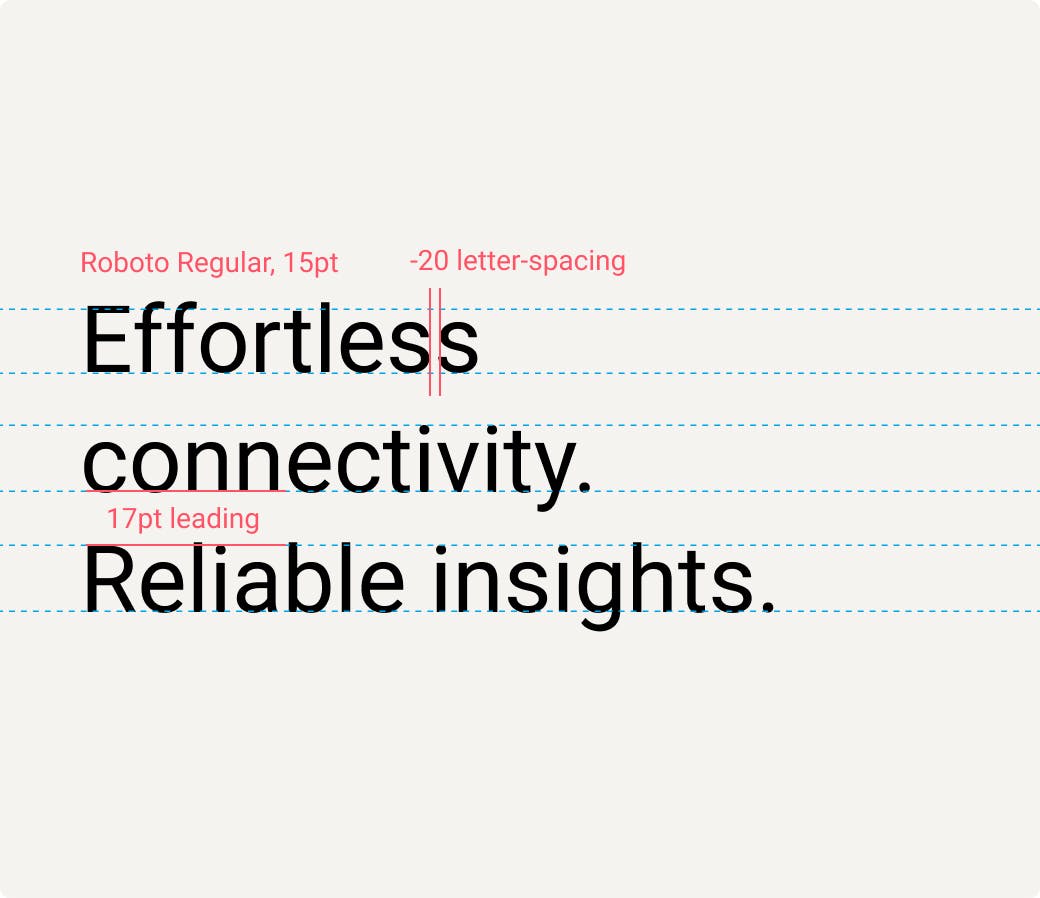
Subheadlines
Subheadlines should be typeset in Roboto Regular with a -20 letter spacing (tracking) value and a line spacing (leading) value that is 2pt larger than the font size value. For example, a 15pt subheadline should use a 17pt leading value.
As a general rule, they should be sized roughly 1/4 the size of the primary headline.
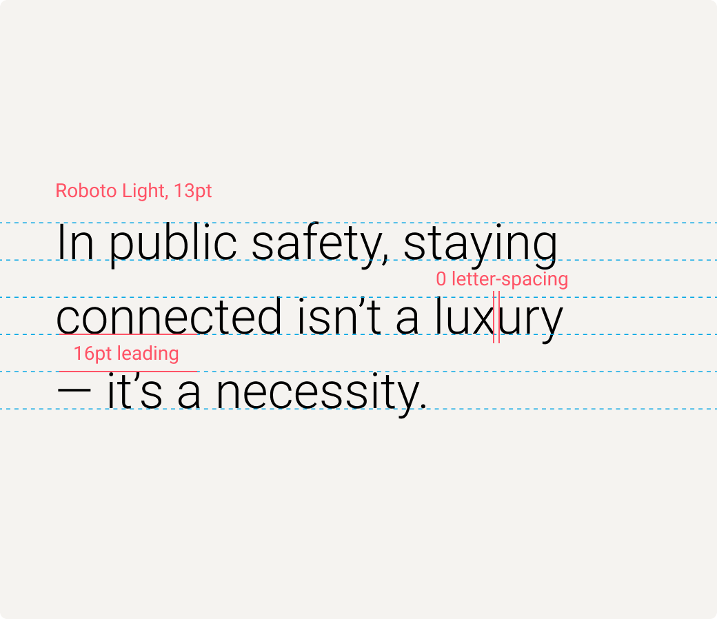
Intro copy
Intro copy should be typeset in Roboto Light with a 0 letter spacing (tracking) value and a line spacing (leading) value that is 3pt larger than the font size value. Intro copy may be used within a range of 11pt to 13pt font sizes. For example, 13pt intro copy should use a 16pt leading value.
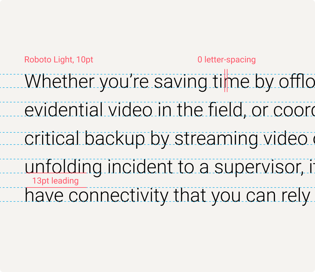
Body copy
Body copy should always be typeset in Roboto Light at 10pt font size, with a 0 letter spacing (tracking) value and a line spacing (leading) value of 13pt.
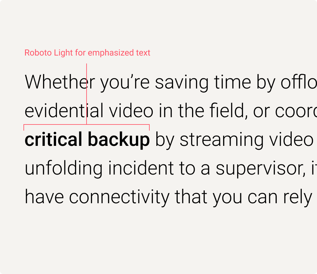
Emphasized text
Text can be emphasized within a sentence or paragraph by using Roboto Medium (not Roboto Bold, which is not a permitted font).
Sidebar copy
Sidebar copy should be typeset in Roboto Regular with a 0 letter spacing (tracking) value and a line spacing (leading) value that is 3pt larger than the font size value. Sidebar copy may be used within a range of 9pt to 13pt font size.
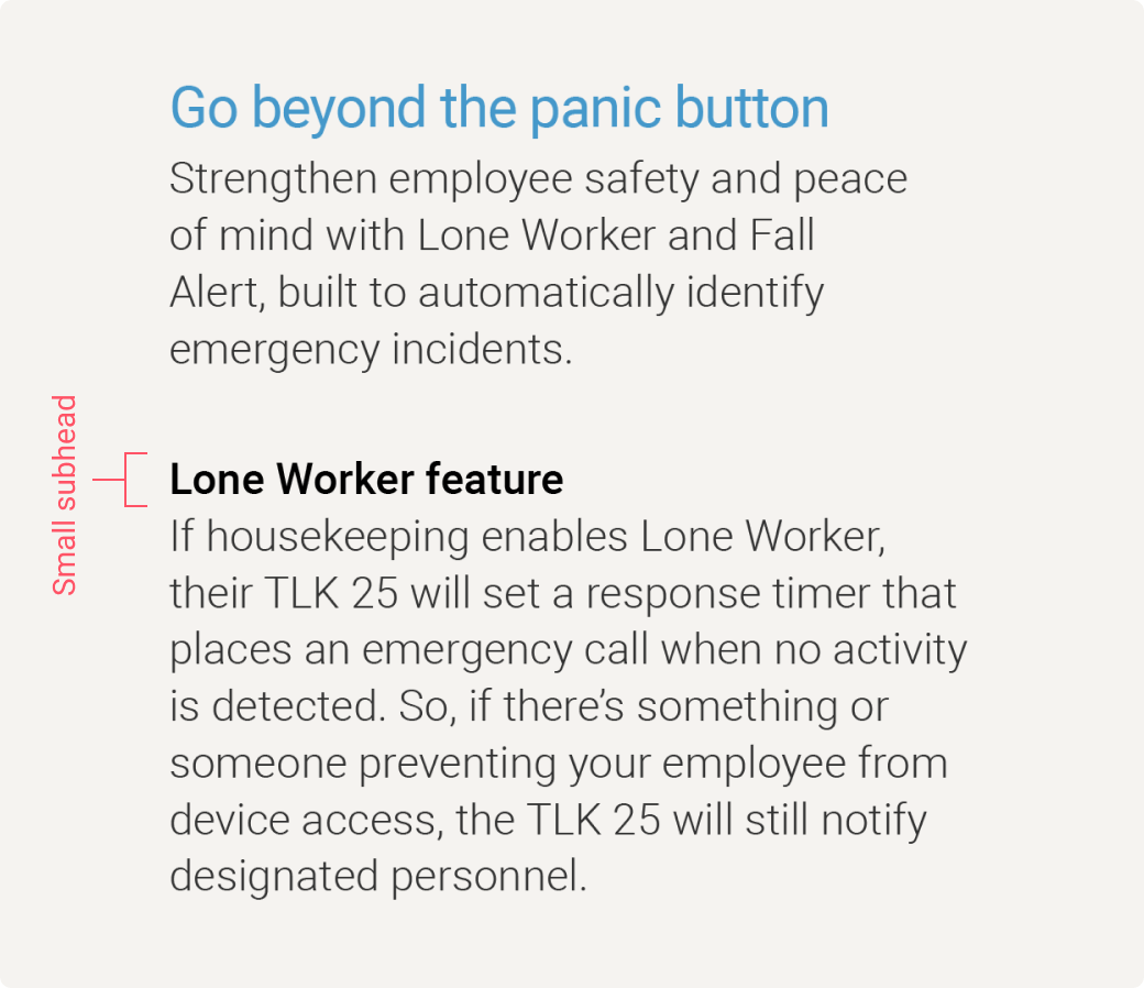
Small subheads
The smallest level subheads in your document may be typeset in Roboto Medium with a 0 letter spacing (tracking) value and a line spacing (leading) value that is 2pt larger than the font size value.
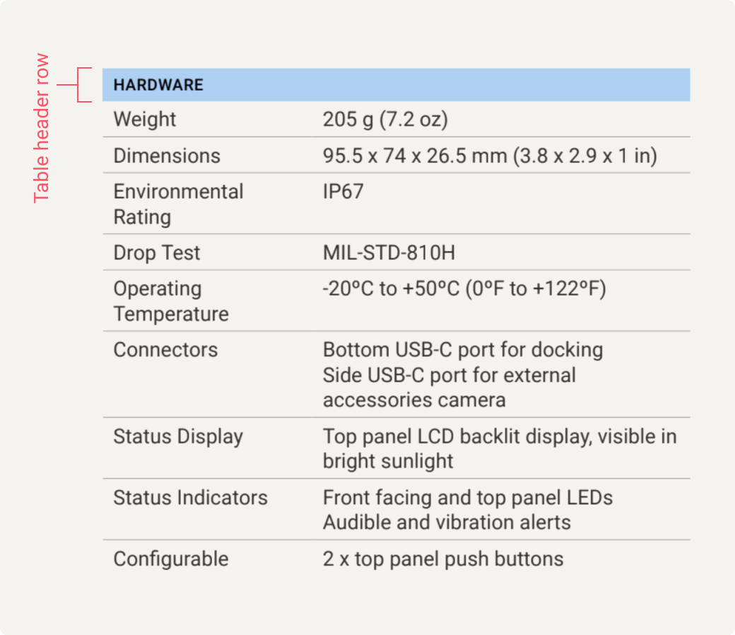
Table header rows
Table header row copy should be styled the same as Label text — use Roboto Medium font with a 0 letter spacing (tracking) value in all-caps. Line spacing (leading) should not apply as table header row copy should be short and not run on more than one line.
Use a font size 1pt smaller than the font size used for table copy.
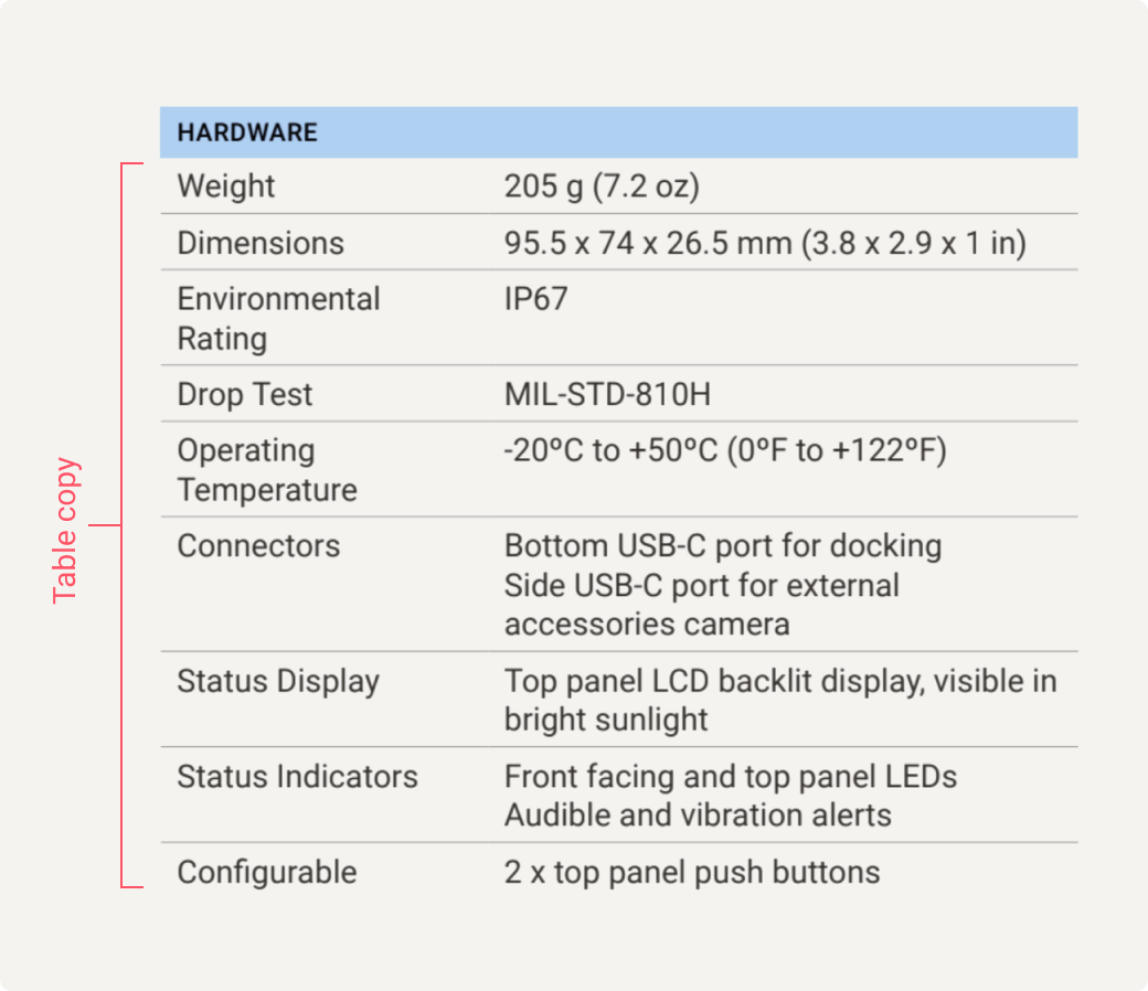
Table copy
Copy used in specification tables, where cell space is limited, should be typeset in Roboto Regular with a 0 letter spacing (tracking) value and a line spacing (leading) value that is 2pt larger than the font size value. Table copy may be used within a range of 7pt to 9pt type size.
Text used in the header column of a specifications table refers to specific features, characteristics and measurements and should use title case capitalization.
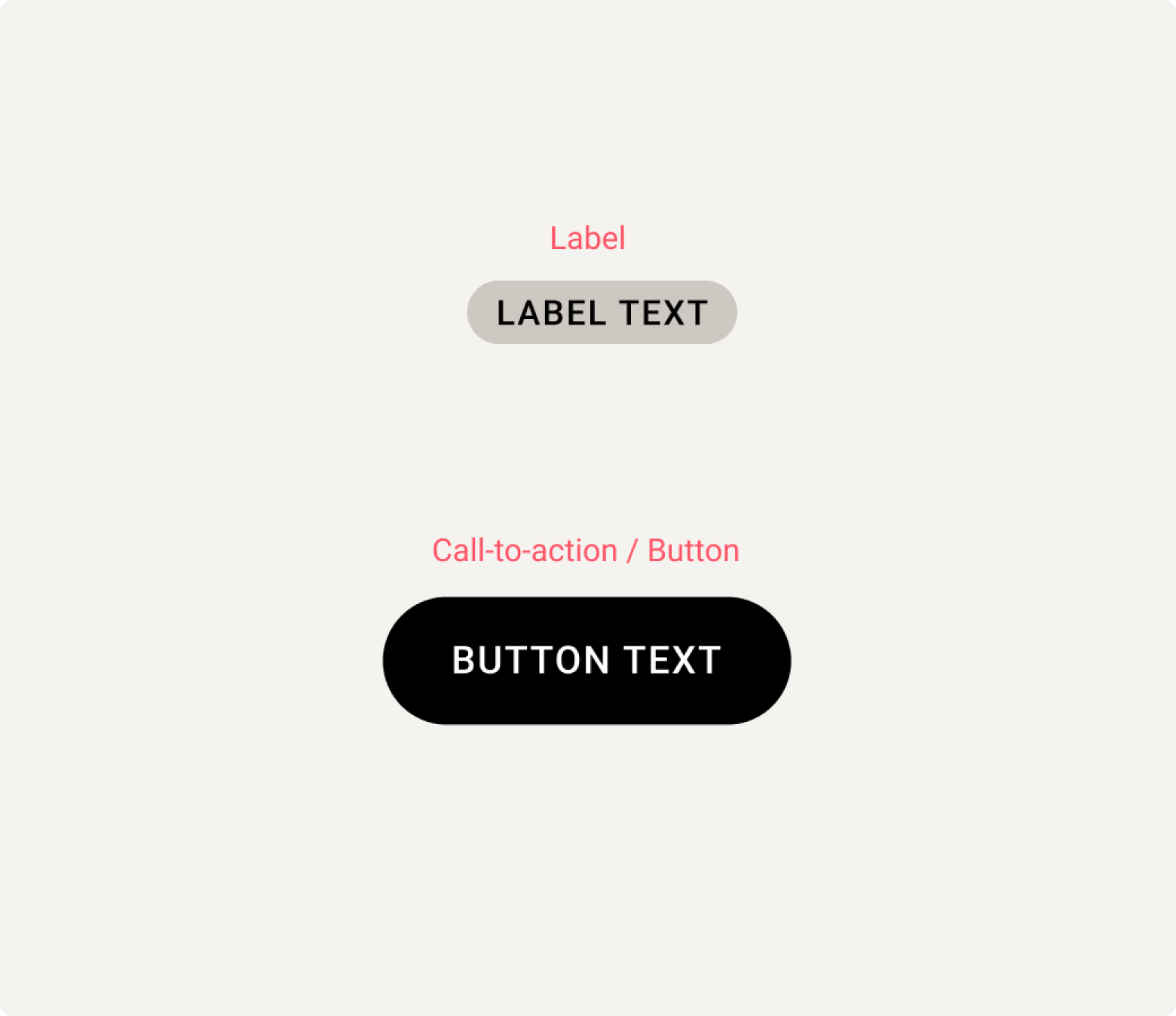
Labels and calls-to-action (CTAs)
Small labels and CTAs like buttons should be typeset in Roboto Medium in all-caps with a +10 letter spacing (tracking) value. Labels should be used sparingly to denote sections of documents or functional information.
Labels are used to denote asset type in our collateral templates — they are pre-styled and placed for you to simply add your content.
Contrast and accessibility
Legibility is vital in all communications. Follow these guidelines to ensure text can always be easily read.
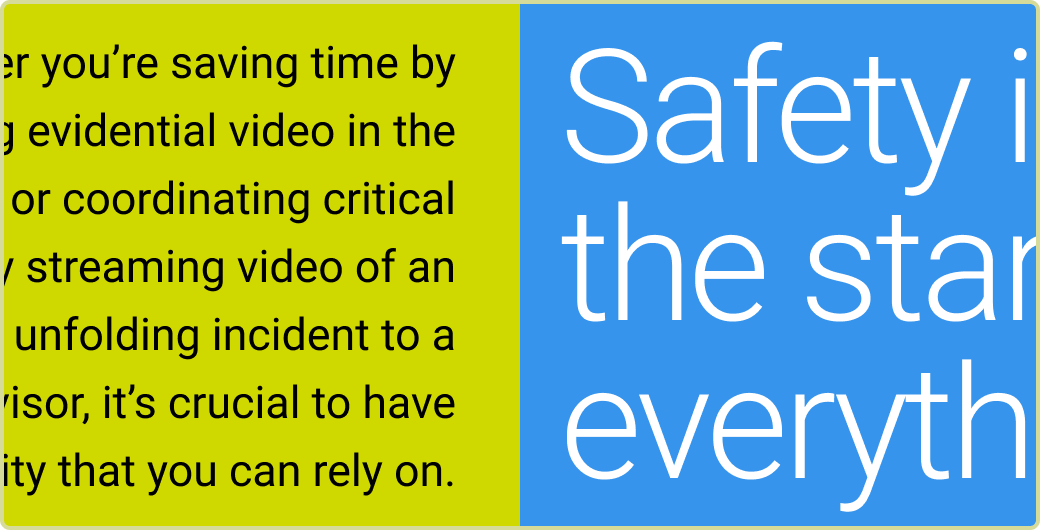
Text should always be set in black or white when on color backgrounds.
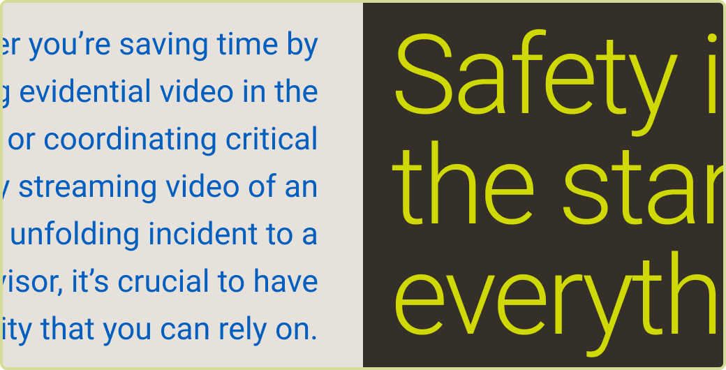
Text may be set in colors from our brand color palette when on black, white, or neutral backgrounds.
Subtle gradients can be used to improve legibility on top of imagery.
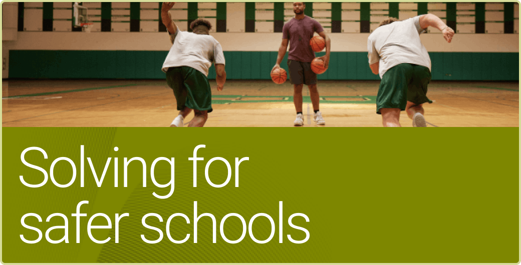
Solid color backgrounds can be used to ensure legibility on top of imagery.
Do not add drop shadows or other effects to text.
Examples
For many examples of how typography can be used in Motorola Solutions designs, please visit the Collateral page.
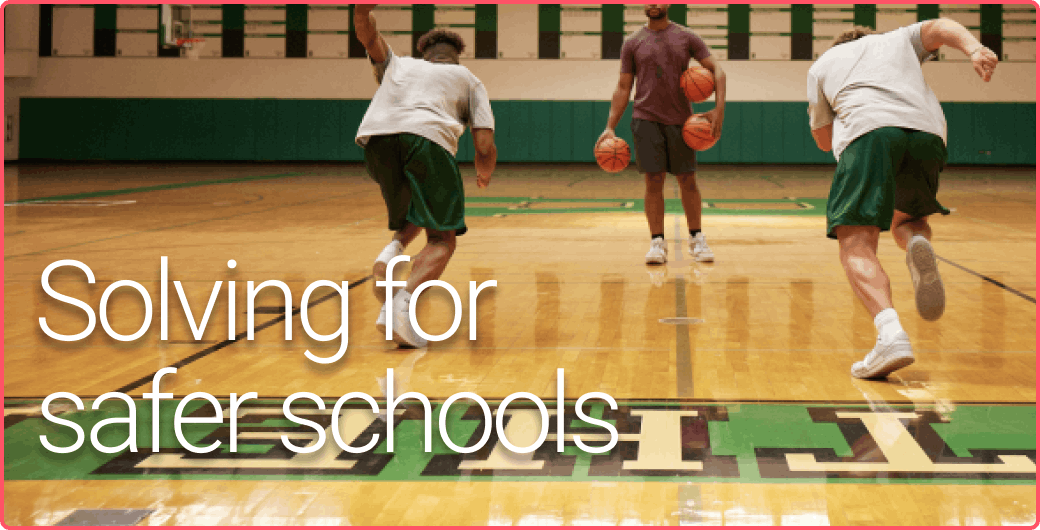
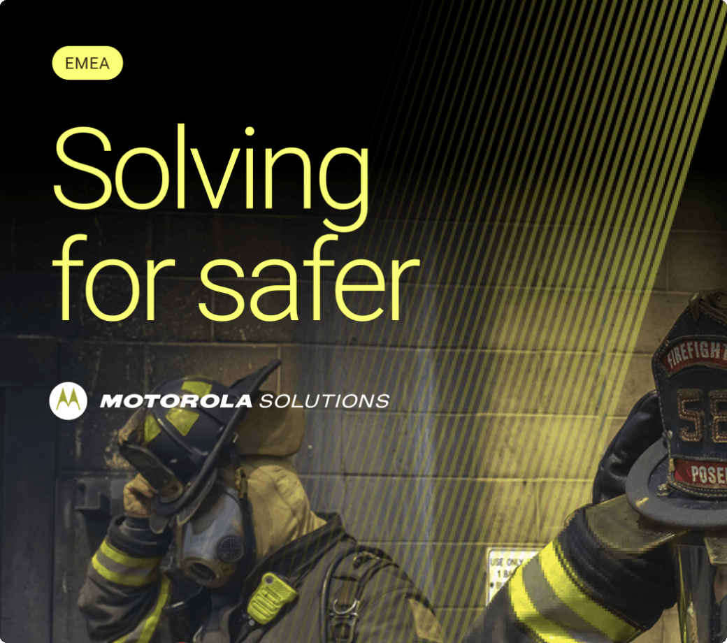
Key Message
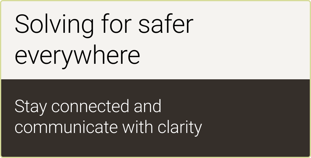
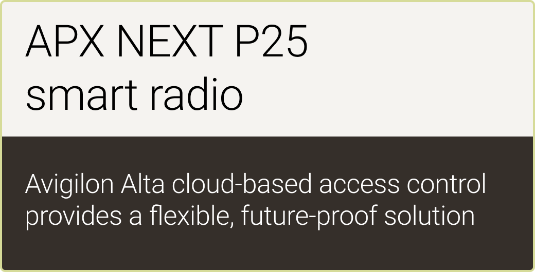
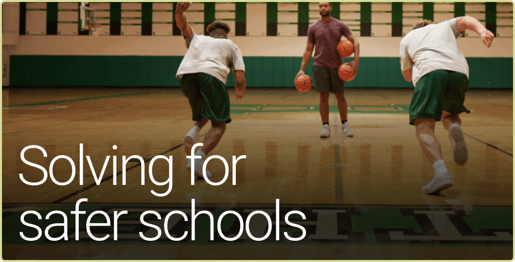
“Solving for safer” typographic treatment
Placement
Please note that “Solving for safer” is a key message, but not a tagline for our brand. The phrase can be used as a headline in intros and outros in proximity to our logo, but it should never be locked up with our logo in a way that makes it appear to be a tagline.
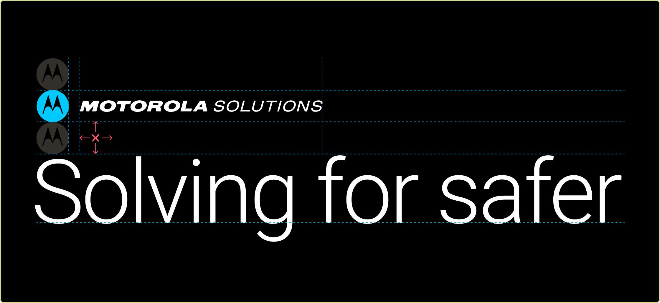
“Solving for safer” should be treated as a headline. It can appear in the same piece with the Emsignia or full logo if minimum clear space rules are followed.
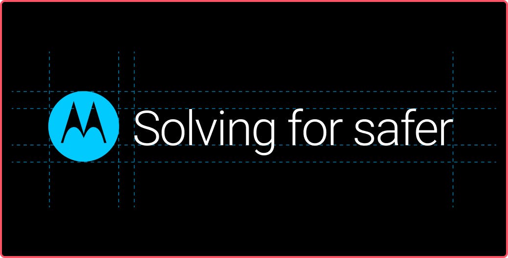
Do not treat “Solving for safer” like a logo mark by locking it up with the Emsignia.
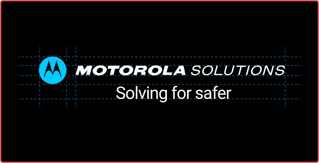
Do not treat “Solving for safer” as a tagline by locking it up with the Motorola Solutions signature.
Usage
The examples below demonstrate proper punctuation when using our brand narrative in a given design. It should always appear in sentence case and may wrap to a second line if space is limited.

The key message should be sentence-case with no punctuation.

When two lines are needed, the line break should be after “Solving.”
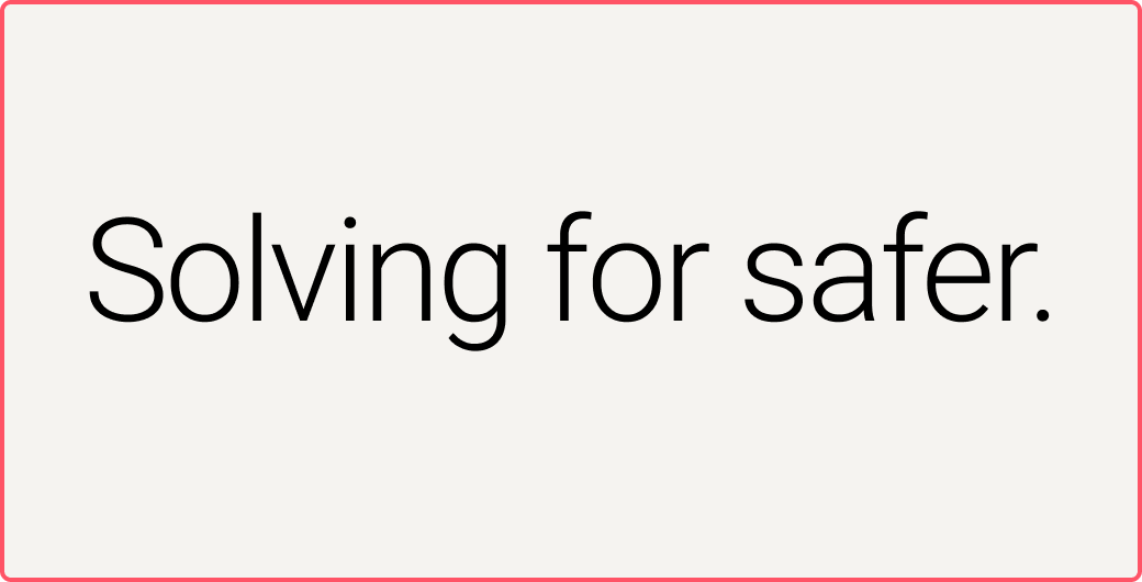
Do not add punctuation when not used in a full sentence.
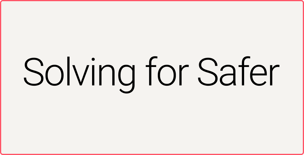
Do not capitalize “safer.”

Do not use font weights other than Roboto Light when treating as a headline.
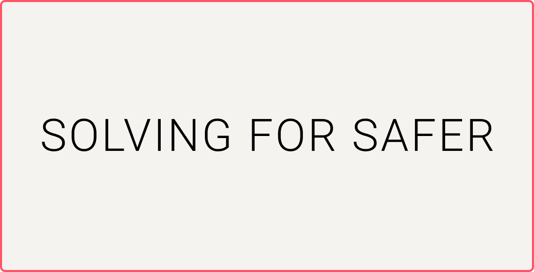
Do not use all-caps.
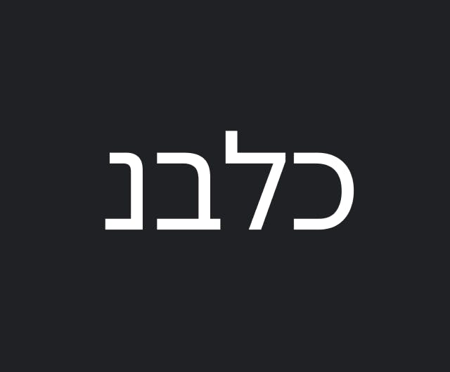
Hebrew
Heebo
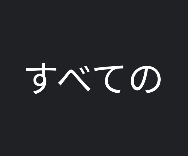
Japanese
Noto Sans JP
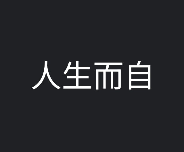
Simplified Chinese
Noto Sans TC
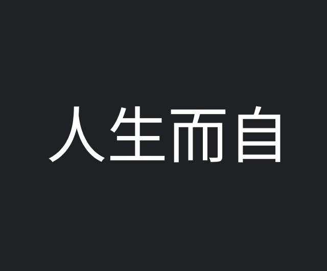
Traditional Chinese
Noto Sans TC
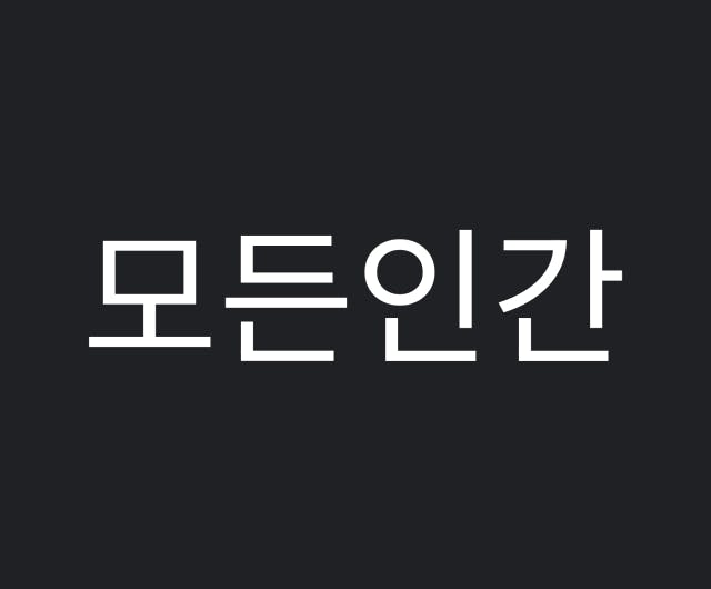
Korean
Noto Sans KR
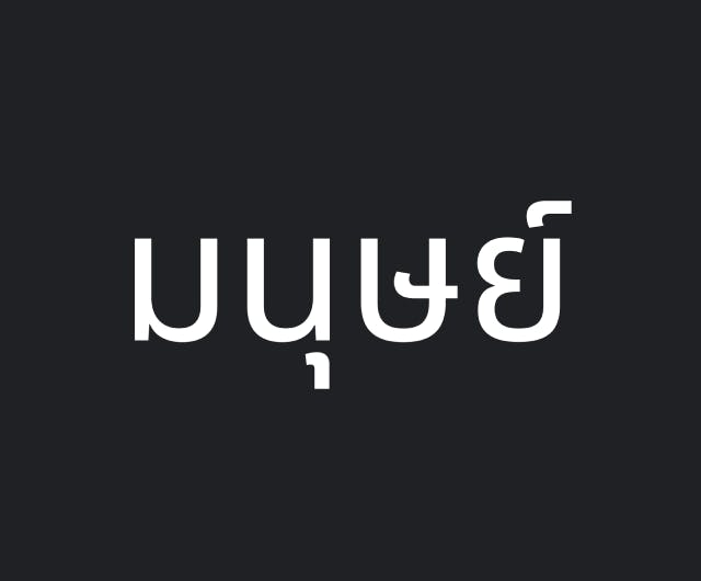
Thai
Noto Sans Thai
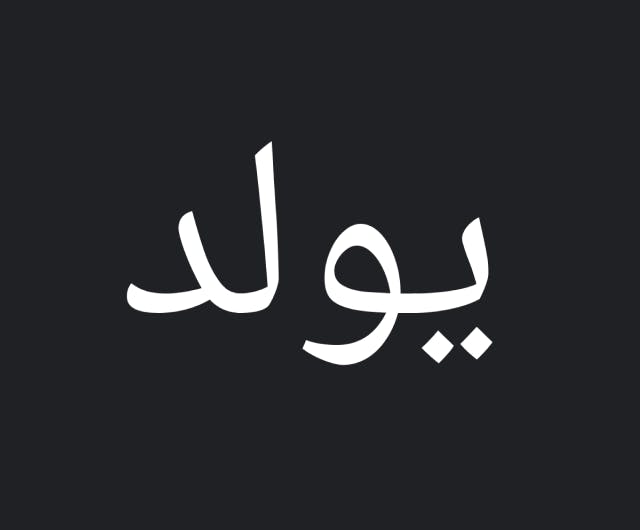
Arabic
Noto Sans Arabic
Downloads
Typography downloads
All approved fonts and weights are included for download below. Please only use the permitted fonts outlined in this section: Roboto Light, Roboto Regular and Roboto Medium.
GOOGLE FONTS
Brand Font (Roboto)
Download our brand font in all permitted weights.